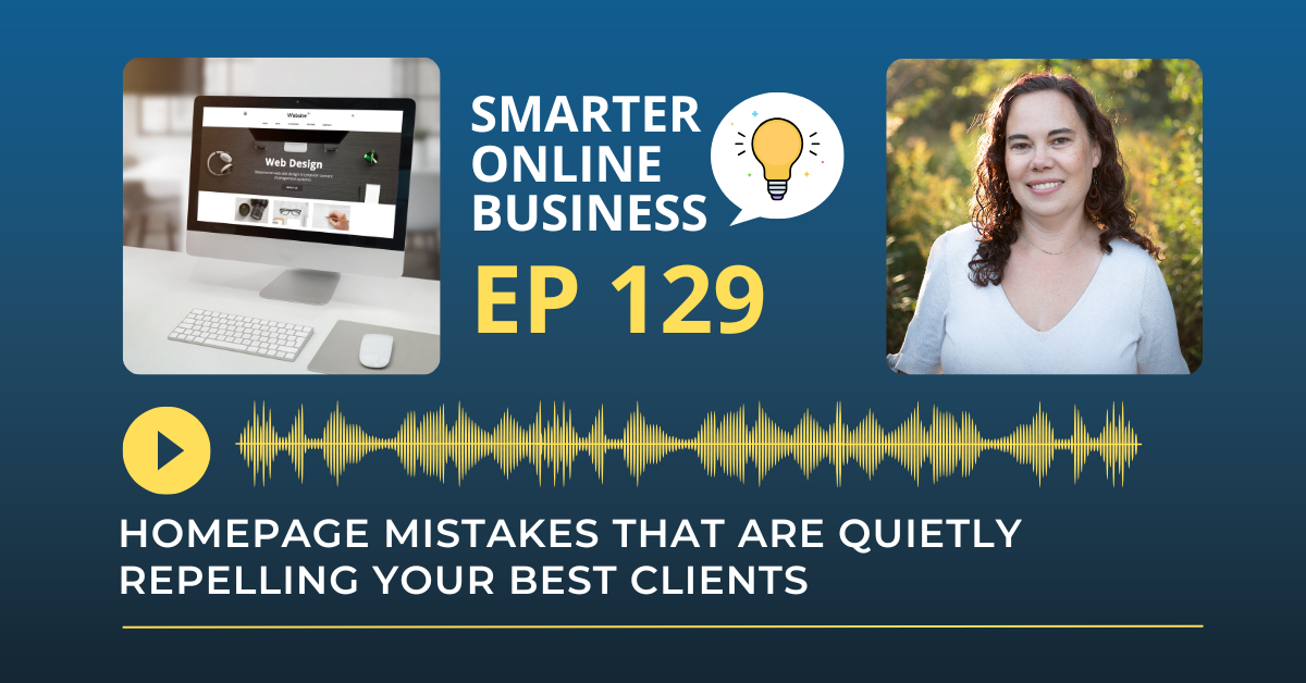
Your homepage is often the first impression your business makes.
But here’s the truth: most homepages are quietly repelling the very people you want to work with.
In today’s episode, I’m walking you through the most common homepage mistakes I see (even on beautiful, modern websites)… and how to fix them.
We’ll cover design, copy, and strategy—because it’s not about looking good, it’s about guiding action.
And at the end, I’ll give you a simple test you can run today to see if your homepage is helping or hurting your conversions—so stick with me.
Let’s Recap: Homepage Mistakes That Are Quietly Repelling Your Best Clients
Your homepage sets the tone for everything your brand promises, and most sites lose visitors in the first five seconds. That tiny window is when a new visitor decides if they are in the right place, if you solve their problem, and where to go next. When those answers are unclear, people bounce, no matter how pretty your design looks or how much you spend on traffic.
The fix starts with clarity: plain-language headlines, purposeful layout, and an obvious next step. Treat the homepage like an airport terminal, not a museum. Every element should guide a specific journey, not invite endless browsing or confusion.
Start with a Clear, Benefit-Focused Headline
The fastest win is your headline. Clever copy that could fit any business starves people of meaning, and vague slogans push them away.
Use a simple formula:
I help [who] do [what] so they can [specific result].
This forces a niche, a verb, and a promise. For example:
“I help course creators build high-converting sites without tech overwhelm.”
It says who, what, and why in one breath. Pair that headline with a subhead that names the problem and outcome in concrete terms, and you’ve given the brain the context it craves. Don’t hide the payoff behind metaphors—lead with it.
Design for Decisions, Not Decoration
Design should serve decisions, not just look good. Give visitors a clear visual path using one primary call to action and a single secondary option.
Buttons should be obvious, above the fold, and consistent in label text. Reduce visual noise: too many cards, sliders, and competing colors increase cognitive load and stall action.
Think of your homepage like a storefront window: when it’s cluttered, people walk past; when it’s curated, they step inside.
Use scannable sections that answer:
- What you do
- Who it’s for
- Why it works
- What to do next
Each section earns its spot by moving a visitor one step closer to action.
Build Trust Through Proof
Trust is the conversion multiplier. In a world where skepticism is the default, your homepage needs proof as much as it needs polish.
Prioritize short, specific testimonials over generic praise. Add recognizable logos where appropriate, show certifications, and use security badges for checkout.
If you’re light on social proof, borrow trust ethically: highlight partnerships, feature press mentions, or share a warm founder photo with a short note on your approach. The goal isn’t to brag—it’s to lower risk perception.
Rotate testimonial styles and voices so more visitors find someone they can relate to. This boosts both relevance and confidence.
Run a Three-Minute Homepage Test
Run a quick test on your phone to expose gaps fast. Without scrolling, can you answer:
- Who is this for?
- What problem do they solve?
- What’s the next step?
If you can’t hit all three, tighten your headline, clarify your subhead, and place a single, unmistakable button above the fold. Then ask a business friend to repeat the test and report what they saw on the first screen.
Your aim is message-market match at a glance. Once those essentials are in place, add concise benefits, a brief explainer, and proof. Keep everything else lightweight: fewer choices, clearer labels, and consistent calls to action.
Think of Your Homepage Like a Sales Conversation
If you want deeper structure, map your homepage like a sales conversation:
- Clarify identity and problem
- State your promise and delivery
- Show proof
- Reduce risk
- Invite the next step
Resist dumping every offer or blog post onto the page—you’re building a runway, not a library.
When you align clear copy, focused layout, and visible trust, your existing traffic becomes more valuable overnight. You don’t need more visitors to grow—you need more visitors to understand you faster.
That’s the real conversion edge, and it’s within reach with a few precise changes.
Rate, Review, & Follow on Apple Podcasts
If you’re loving my eCommerce Made Easy Podcast, I’d be thrilled if you could rate and review the show on Apple Podcasts. Your ratings and reviews help me reach more listeners and empower more people like you to thrive in the online business world.
Just click here to head over to Apple Podcasts, scroll down, give us a five-star rating, and share what you enjoyed most about the episode in the “Write a Review” section.
If you haven’t hit that follow button yet, now’s the perfect time! I have new episodes coming your way every week that you won’t want to miss. Hit the follow button and stay up to date with the eCommerce Made Easy Podcast! Follow Now!